
Nicole with Ventus Design Studio is my go-to expert whenever I have any struggles with my website. She always knows the answer and is a fantastic resource.
Gillian PerkinsStartup Society 
Nicole with Ventus Design Studio is incredible. She’s responsive, the turnaround is amazingly fast, and she gives great advice on our short and long term website strategy.
Sam BryantBryant Taylor Law 
I've worked with Ventus Design Studio for years. I can always rely on them to do an excellent job. They are incredibly responsive to any questions I have. It's a relief to not have to worry about my website updates.
Jimmy SklavenitisThe Greek Joint 
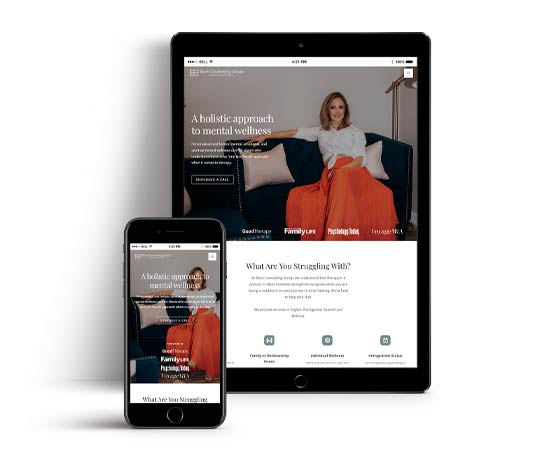
A big thank you to Nicole from Ventus Design Studio for creating a boutique style website that is so elegant and professional and reflects my approach to mental wellness. I am so proud of this website and design!
Deborah BlumBlum Counseling Group 
I booked two new clients through my new website within the first week. This site looks amazing and makes me feel so professional. I truly love it!
Shanice BynesSHANIIV 
I am hard to impress. Nicole Sauk at Ventus Design Studio has continued to showed me what a great professional she truly is.
Kaustubh NadkarniNadkarni Law 
Ventus Design Studio transformed my old, outdated, un-secure website into a beautiful one that fits the vision I had perfectly! I highly recommend Nicole and her expertise!
Gabe CoxRed Hot Midset 
My site is absolutely amazing and I couldn’t be happier!
Derrick KestlerThe Dent Demon 